Learnovation Website

Redesign in 5 days

LEARNOVATION — AUGUST 2024

My Role

Lead Product Designer — Visual Design, User Flows, Prototyping, Design System

Tools

Figma, Adobe Illustrator

Team

Founder

1 Project Manager

Duration & Status

5 days, Handed off to development

Context

In late August, I joined Learnovation as part of a second wave of designers to help redesign their website. With just five days until the deadline, I quickly noticed a problem: the designs weren’t optimized for developers, making their work more difficult.

How I added value

As the Product Designer on this project, I worked closely with the team to streamline the development process. I created a clear, easy-to-use design system to build the foundation for the website and documented everything to ensure a smooth handoff from design to development.

5 days

to redesign and handoff a fully responsive, developer-friendly website

10+ components

reusable components and interface patterns built from scratch

100+ tokens

foundational tokens defining color, spacing, typography, and layout

5 days

to redesign and handoff a fully responsive, developer-friendly website

10+ components

reusable components and interface patterns built from scratch

100+ tokens

foundational tokens defining color, spacing, typography, and layout

HIGHLIGHTS

Redesigned website with a simple design system

HIGHLIGHTS

Redesigned website with a simple design system

HIGHLIGHTS

Redesigned website with a simple design system

0.1

Homepage recording

VIDEO

0.2

Mobile Homepage

IMAGE

0.2

Mobile Homepage

IMAGE

0.2

Mobile Homepage

IMAGE

0.3

Sample components

IMAGE

0.3

Sample components

IMAGE

0.3

Sample components

IMAGE

PROBLEM

Inconsistent design makes development difficult

PROBLEM

Inconsistent design makes development difficult

PROBLEM

Inconsistent design makes development difficult

The context — what I spotted

In late August, I jumped into the project as part of a second wave of designers tasked with revamping the Learnovation website. It was crunch time and the deadline was just five days away, but right away, I noticed a major problem...the designs were not optimized for development

THE PROBLEM

The website designs were not optimized for development at all!

THE PROBLEM

The website designs were not optimized for development at all!

THE PROBLEM

The website designs were not optimized for development at all!

Chaos is in the details...

Many components lacked consistency, like the navigation header’s margin differing from the hero section and its oversized 344px height. This lack of uniformity made it hard to maintain a cohesive design and slowed down both designers and developers.

1.0

layout breakdown

IMAGE

1.0

layout breakdown

IMAGE

1.0

layout breakdown

IMAGE

SOLUTION

Develop a cohesive Figma design system

SOLUTION

Develop a cohesive Figma design system

SOLUTION

Develop a cohesive Figma design system

Fix the Impossible in Five Days

As soon as I spotted the issue, I alerted the stakeholder, explaining how the design’s lack of structure could cause bigger problems later. They asked for a solution, so I proposed a streamlined design system with clear documentation—while also redesigning the entire website. The challenge? We had just five days to do it all.

THE SOLUTION

Create a cohesive design by building a design system and redesigning the entire website—all within 5 days.

THE SOLUTION

Create a cohesive design by building a design system and redesigning the entire website—all within 5 days.

THE SOLUTION

Create a cohesive design by building a design system and redesigning the entire website—all within 5 days.

Design System Details

Establishing the foundation before anything else

Design System Details

Establishing the foundation before anything else

Design System Details

Establishing the foundation before anything else

Setting up breakpoints

The first step was establishing breakpoints and grids for desktop, tablet, and phone to ensure the website would be responsive across all devices. I prioritized this because the original design was set at 1923px, which isn’t ideal for development.

3.0

Responsive layout grids

IMAGE

3.0

Responsive layout grids

IMAGE

3.0

Responsive layout grids

IMAGE

Using the 4px spacing

Next, I created tokens using the 4px spacing rule to keep everything consistent with the grids I set up. I made sure to do this early on because if there are any spacing inconsistencies, it can be confusing for both designers and developers

3.1

Spacing tokens

IMAGE

3.1

Spacing tokens

IMAGE

3.1

Spacing tokens

IMAGE

Setting up uniform type sizes

After that, I turned my attention to typography, ensuring that all headers and body text were consistent in size and thickness throughout the website. This step is important because having uniform typography can really enhance the design, making it look cleaner, more cohesive, and more professional.

3.2

Typography Styles

IMAGE

3.2

Typography Styles

IMAGE

3.2

Typography Styles

IMAGE

Tokenizing our styles

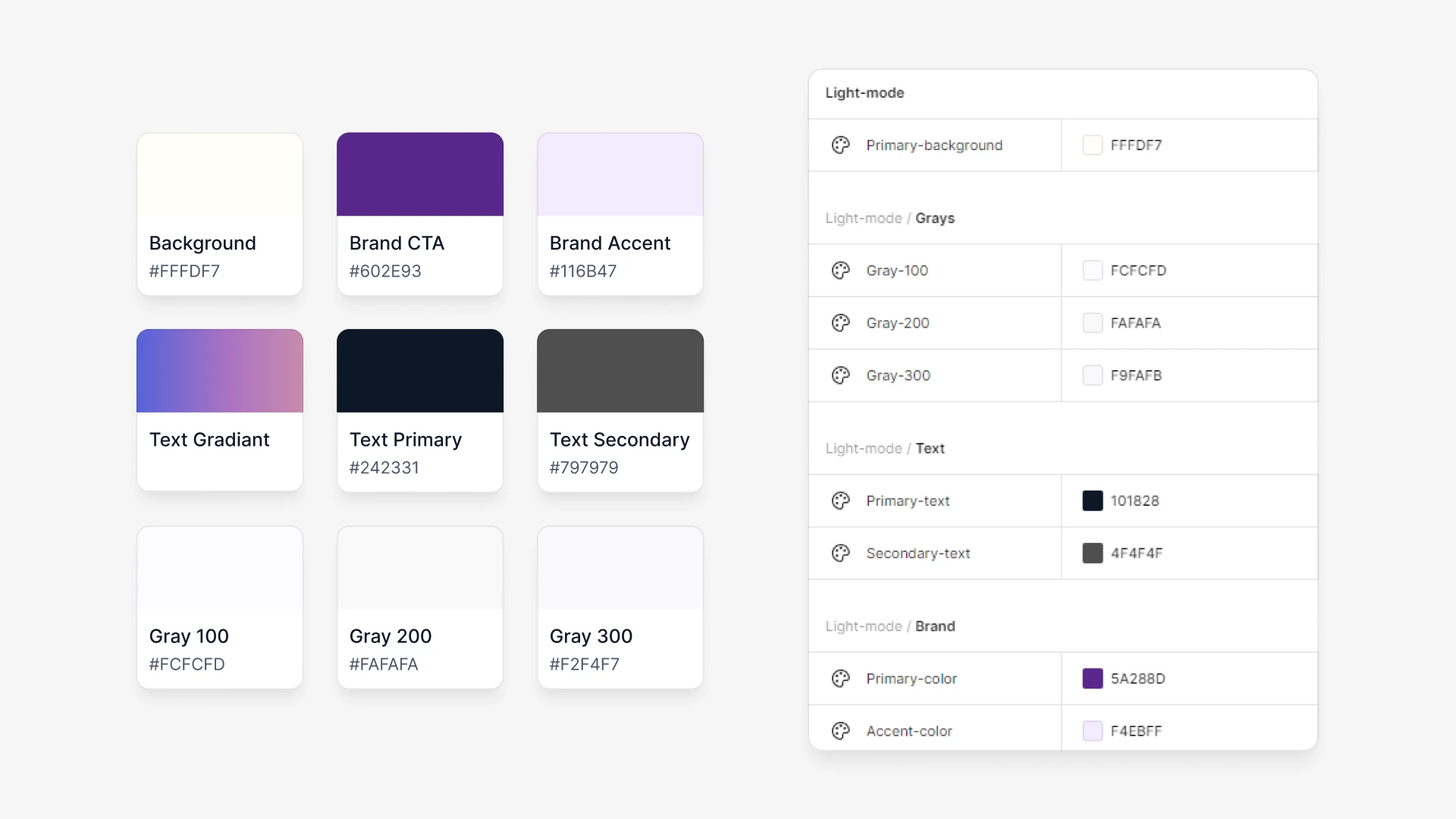
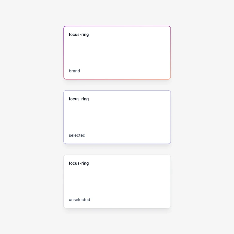
Finally, I reviewed the original design and added elements like colors, focus rings, and shadows to our design system. This helped me stay true to the work of the first wave of designers while keeping track of which elements to keep and which ones to remove.
3.3

miscellaneous tokens & styles

IMAGE

3.3

miscellaneous tokens & styles

IMAGE

3.3

miscellaneous tokens & styles

IMAGE

UI Redesign

Deep in the website redesign trenches

UI Redesign

Deep in the website redesign trenches

UI Redesign

Deep in the website redesign trenches

Pivoting to a 1-page website

With four days left, I pivoted the team from a multi-page site to a one-page landing site to meet the deadline. This ensured everything was polished, aligned with our design system, and, most importantly, met our deadline—though it was going to be tight.

4.0

Old website Info Architecture

IMAGE

4.0

Old website Info Architecture

IMAGE

4.0

Old website Info Architecture

IMAGE

4.1

New website Info Architecture

IMAGE

4.1

New website Info Architecture

IMAGE

4.1

New website Info Architecture

IMAGE

Shrinking the Super-Sized Nav

The first element I redesigned was the Header Navigation. The old design was too big (because of the logo size) and didn’t follow standard sizing for header navigation.

4.2

Old Navigation

IMAGE

4.2

Old Navigation

IMAGE

4.2

Old Navigation

IMAGE

4.3

New navigation

IMAGE

4.3

New navigation

IMAGE

4.3

New navigation

IMAGE

Taming the Oversized Hero

I redesigned the Hero section to fix misalignment and oversized dimensions that could cause development issues. I adjusted margins to fit the grid, added 4px spacing for better balance, and combined graphics into one image to prevent shifting on resize.

4.4

Old hero section

IMAGE

4.4

Old hero section

IMAGE

4.4

Old hero section

IMAGE

4.5

new hero section

IMAGE

4.5

new hero section

IMAGE

4.5

new hero section

IMAGE

Polishing the About Section

I refined the About section by ensuring consistent paragraph width and image sizes, cleaning up the type hierarchy, and removing shifting elements. To add flair, I included fun icons and checked with the stakeholder to confirm the text copy.

4.6

Old About Section

IMAGE

4.6

Old About Section

IMAGE

4.6

Old About Section

IMAGE

4.7

New about section

IMAGE

4.7

New about section

IMAGE

4.7

New about section

IMAGE

Making the Newsletter hot, hot, hot

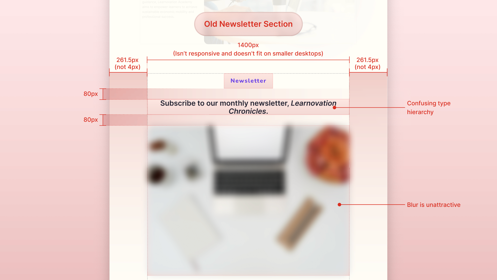
I redesigned the Newsletter section to feel more inviting rather than discouraging. I switched the background to purple for visual interest, added subtext for clarity, and included an input field to make subscribing easy.
4.8

old newsletter

IMAGE

4.8

old newsletter

IMAGE

4.8

old newsletter

IMAGE

4.9

New newsletter

IMAGE

4.9

New newsletter

IMAGE

4.9

New newsletter

IMAGE

Refreshing the Contact Section

I redesigned the Contact section to improve its visual appeal. Rather than cramming everything into one frame, I grouped elements separately and used negative space for better organization. This made the layout cleaner and more engaging.

4.10

Old contact section

IMAGE

4.10

Old contact section

IMAGE

4.10

Old contact section

IMAGE

4.11

new contact section

IMAGE

4.11

new contact section

IMAGE

4.11

new contact section

IMAGE

Giving the Footer a Purpose

I completely redesigned the Footer to make it both fun and functional. Using company colors, I added key details like navigation tabs, contact info, and a call-to-action for donations. This made it more engaging while also helping the company convert more users.

4.12

old footer

IMAGE

4.12

old footer

IMAGE

4.12

old footer

IMAGE

4.13

New footer

IMAGE

4.13

New footer

IMAGE

4.13

New footer

IMAGE

Final Designs

After many days, here's the final redesign!

Final Designs

After many days, here's the final redesign!

Final Designs

After many days, here's the final redesign!

Wrapping Up the Redesign

By day four, I had finalized the copy, documented everything, and added developer notes. On the fifth day, I completed the website and handed it off. After a fast-paced sprint, I’m proud of how the Learnovation redesign came together.

5.0

PROTOTYPE OF WEBSITE DESIGN

FIGMA EMBED

5.1

Homepage recording

VIDEO

5.2

Mobile Homepage

IMAGE

5.2

Mobile Homepage

IMAGE

5.2

Mobile Homepage

IMAGE

5.3

Sample components

IMAGE

5.3

Sample components

IMAGE

5.3

Sample components

IMAGE

Retrospective

Designing under pressure taught me a lot

Retrospective

Designing under pressure taught me a lot

Retrospective

Designing under pressure taught me a lot

Looking back...

I learned a lot taking lead on this project. It also allowed me to stretch my design skills in terms of quality and speed. However, if time had allowed, I would have improved on the following:

Looking back...

I learned a lot taking lead on this project. It also allowed me to stretch my design skills in terms of quality and speed. However, if time had allowed, I would have improved on the following:

Design System Improvements

Looking back, this is kind of the bare bones of a design system...if I had more time, I would have included things like fail states, branding guidelines, etc.

Design System Improvements

Looking back, this is kind of the bare bones of a design system...if I had more time, I would have included things like fail states, branding guidelines, etc.

Design System Improvements

Looking back, this is kind of the bare bones of a design system...if I had more time, I would have included things like fail states, branding guidelines, etc.

Better developer collaboration

Due to time zone differences, I wasn't able to communicate directly with the developer. I had to rely on my experience to make the design developer-friendly.

Better developer collaboration

Due to time zone differences, I wasn't able to communicate directly with the developer. I had to rely on my experience to make the design developer-friendly.

Better developer collaboration

Due to time zone differences, I wasn't able to communicate directly with the developer. I had to rely on my experience to make the design developer-friendly.

More time for iteration

Due to the timeline, I didn't have enough time to iterate and A/B test. In a perfect world, I would've experimented and improved based on real user feedback.

More time for iteration

Due to the timeline, I didn't have enough time to iterate and A/B test. In a perfect world, I would've experimented and improved based on real user feedback.

More time for iteration

Due to the timeline, I didn't have enough time to iterate and A/B test. In a perfect world, I would've experimented and improved based on real user feedback.

Thanks for reading

Check out more Cool Projects

© 2026 All rights reserved

© 2026 All rights reserved

Portfolio made with <3

Portfolio made with <3